Achieving Cult Status Through Customer Obsession
Designing a fast, expressive e-commerce experience that mirrors the energy of Milk’s community.
4.86%
Conversion Rate
$101M
Annual Revenue (2023)
$1.2B
Merger with Obagi
Milk Makeup entered a saturated beauty market with a bold idea: clean, multi-functional products for young, creative, socially conscious consumers. From 2014–2018, as UX Director at Wondersauce, I led the end-to-end design of Milk’s e-commerce platform—translating the brand’s energy into an experience that balanced performance and storytelling.
We streamlined navigation, built robust filtering, and introduced interactions like Quick View to reduce shopping friction, while using educational and documentary-style content to build confidence and deepen engagement. We prototyped motion obsessively in Framer and After Effects, down to micro-interactions. The site delivered a 4.86% first-year conversion rate—Shopify top 10%—and supported two consecutive years of revenue doubling, helping set the foundation for Milk’s $1.2B Obagi merger.
One of the reasons Milk Makeup felt so disruptive—and why it’s stayed enduring—is that it was immediately obvious who the brand was for.
From day one, Milk wasn’t trying to appeal to everyone. It was speaking directly to young creatives working in New York’s art, fashion, and music scenes—the people pulling long days in the studio and then heading straight into nightlife. In a sentence, it was: art kids, high-concept/low-maintenance, clean beauty standards.
The anthem that announced Milk Makeup’s arrival and positioned the brand as a reflection of NYC’s art, fashion, and music scenes.
And what’s important is that the brand didn’t just communicate that in its marketing. It showed up in the product itself—especially the packaging.
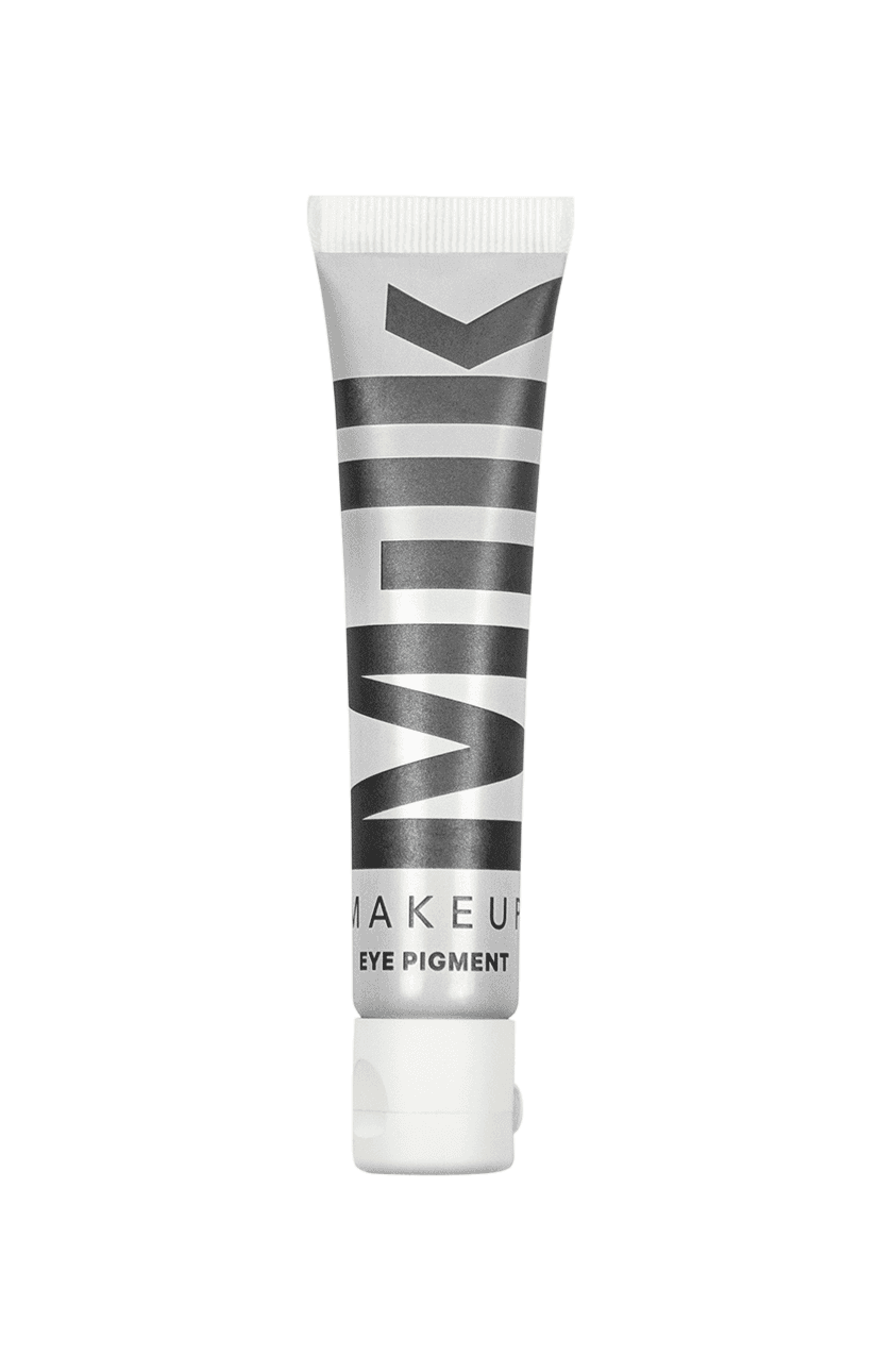
Milk’s industrial design choices weren’t just functional. They were built around affordances. The packaging borrowed the visual and tactile language of artist tools, and it quietly suggested how the products should be used—no brushes, no instructions, just hands, heat, and intuition.
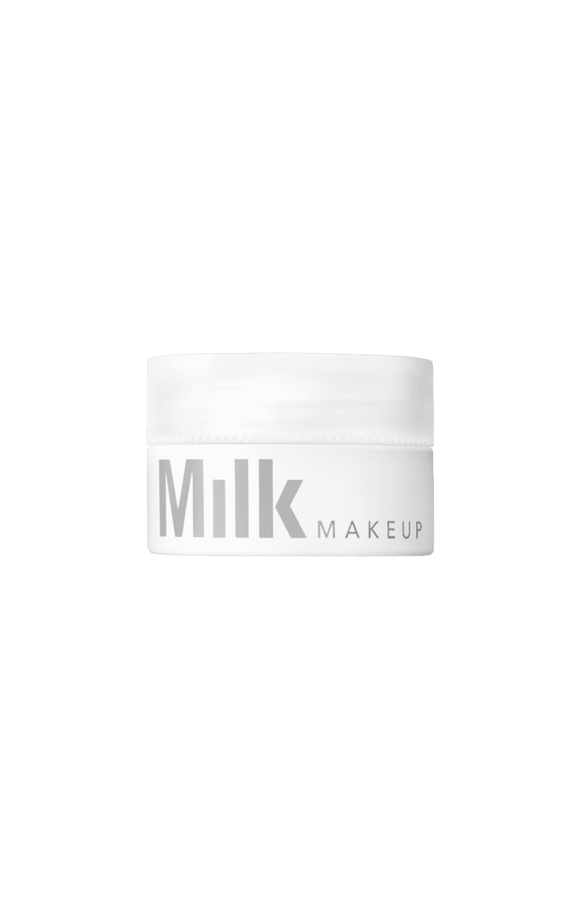
The first product line was basically designed to feel like something you’d grab in a downtown art supply store. Eye makeup came in squeeze tubes that looked like acrylic paints. Lip products were packaged in twist-top jars that recalled the containers artists use to mix or thin paint. Even the secondary packaging could’ve been mistaken for actual studio supplies.
The first product line was designed to resemble materials you’d find in a downtown art supply store. The packaging could’ve been mistaken for actual studio supplies. These products didn’t just look cool—they looked familiar.
And that’s the thing: the products didn’t just look cool—they looked familiar. That familiarity did a lot of work. It lowered the learning curve, reinforced identity, and made the whole brand feel intuitive before you ever tried it.
There’s a comparison I kept coming back to while working on Milk: early versions of the iPhone—this idea that you shouldn’t need a manual.
The experience was so intuitive, so grounded in real-world metaphors, that people just knew what to do. And that same sense of immediacy and delight—of not needing to be told—was exactly what Milk’s packaging was already doing. It was self-explanatory in the best way.
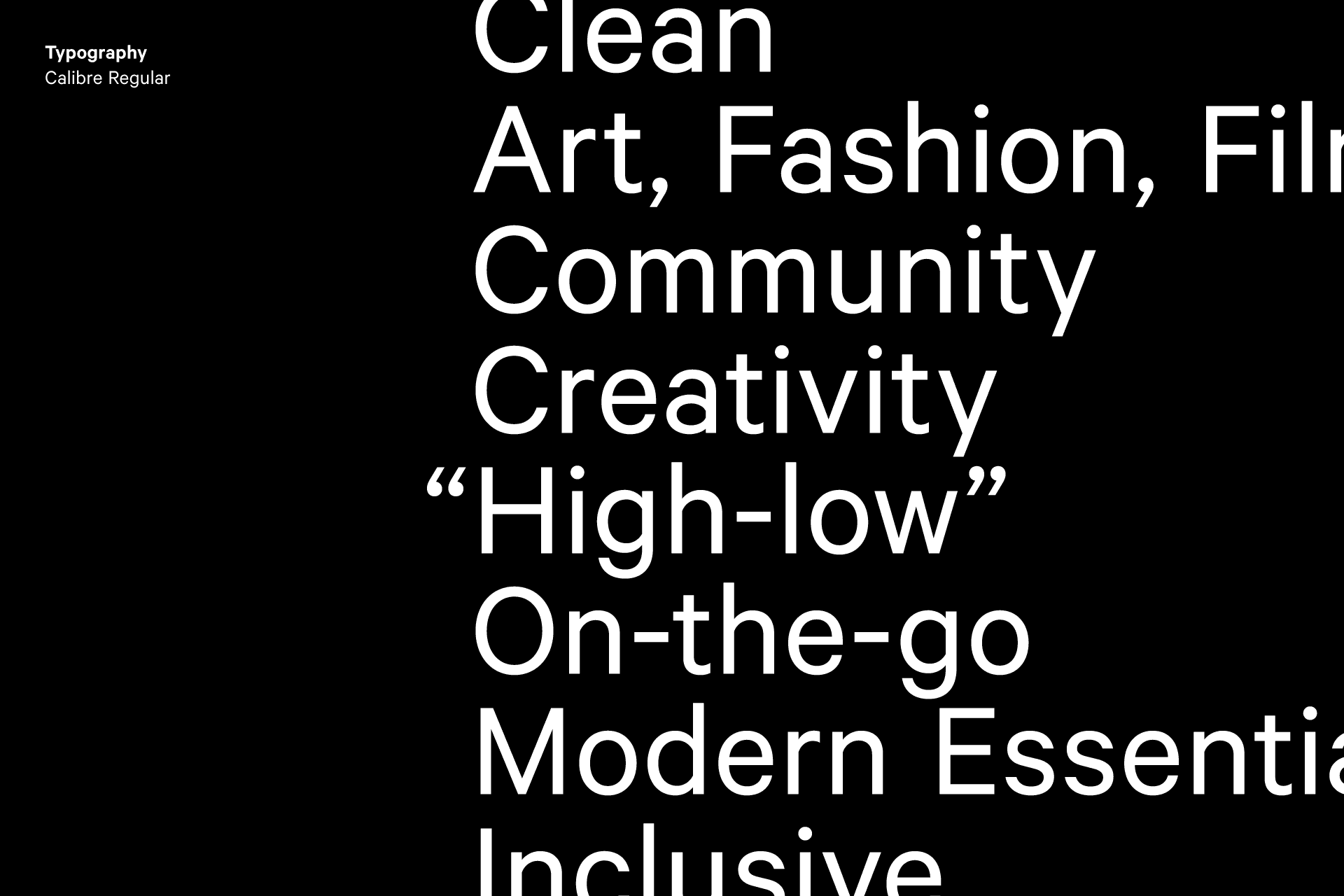
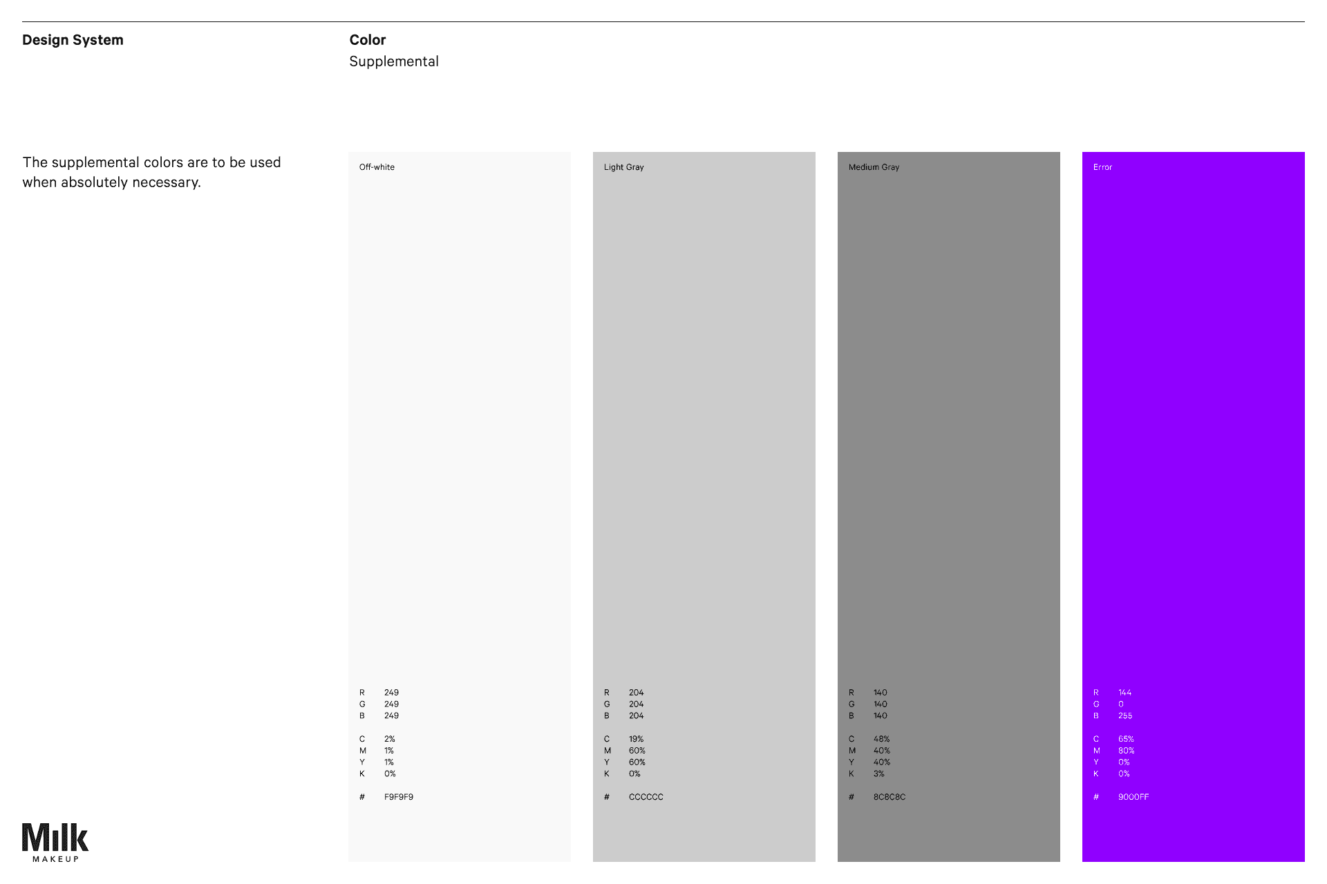
So we tried to bring that same utilitarian, familiarity-first approach into the website. The design system was intentionally stripped down. Typography was just two weights—Regular and Semi-bold. No italics. The palette was essentially white, off-white, and gray, with a single accent hue reserved for error states. Buttons and forms were almost completely unstyled—other than clear state changes—because we wanted the interface to feel neutral and obvious, not ornamental.
We brought the same utilitarian, familiarity-first approach that shaped Milk Makeup’s industrial design and packaging to the design of the website.
And the payoff was that the only real “color” in the experience came from the product itself—the pigmentation of the makeup. The brand expression wasn’t coming from UI decoration; it was coming from the thing the customer actually cared about.
Just as the packaging was designed to feel intuitive—something you could apply with your fingers and body heat—we wanted the digital experience to feel equally effortless. No learning curve. Just immediate clarity: browse, discover, shop.
Navigation was constrained to just four categories: Eye, Lip, Face, and Skincare.
Milk’s customer moves fast—day to night—so the shopping experience needed to be equally efficient. We embraced radical simplicity and collapsed navigation into four clear categories: Eye, Lip, Face, Skincare. It was a deliberate alternative to mega menus: fewer choices, lower cognitive load, faster path to product. But that simplicity created a new challenge—maintaining findability so users could still locate exactly what they needed without friction.
To address the limitations of minimalist navigation, we introduced robust filtering tools on each category page—enabling shoppers to drill down by preferences like “vegan” or “multi-use” ensuring they could quickly and confidently find what they were looking for.
Milk’s traffic is heavily product-led via social, so many first-time visitors land with one item in mind and then face a broad catalog. Without great filtering, that moment turns into decision fatigue. We designed filtering as “information scent”—a Xerox PARC concept—so the interface gives clear cues that you’re getting closer to your goal, whether you’re shopping with intent or exploring. And to keep momentum, we built a Quick View off-canvas modal so users could check variants and add to cart without losing their place. It wasn’t a common pattern then, so we prototyped it from scratch in early Framer and Adobe After Effects.
What I find interesting is that we later saw similar “peek without losing context” patterns in Appleʼs Human Interface Guidelines as macOS adopted related behaviors for the Notification Center. It was a nice reminder that emergent web patterns don’t just follow platforms—sometimes they help shape them.
A motion study of the "quick view" modal that let shoppers explore product variations and add items to their card without losing their place on a category page.
At Wondersauce, six of the sites I led—including Milk—were featured as Best Website on SiteInspire, and I think it’s because we designed at three levels at once: strategic, experiential, and emotional.
Strategic—does this actually solve a real customer problem?
Experiential—is it useful, usable, and frictionless?
Emotional—is it beautiful enough that someone is willing to exchange value—time, attention, money—for it?
The biggest lesson I’ve learned is that great digital experiences often hinge on micro-interactions—those small, task-based details Dan Saffer writes about—and as Charles Eames said, «The details are not the details. They make the design.»
A motion study exploring scroll behavior and transitions between sections in the category view.
For Milk Makeup’s website, we obsessively designed and animated the tiniest moments—adding items to cart, scrolling behaviors, video appearances, and loading states. Each of these lasts just milliseconds, but together, they shape how a user feels. They create emotional resonance and establish trust. When done well, I believe these details don’t just create polish—they create brand equity. They distinguish a brand from its competitors, build loyalty, and become a durable, defensible advantage in the market.
Knowing that 41% of makeup buyers consult YouTube tutorials before purchasing, we embedded product application videos directly on product pages.
Milk customers researched before buying, so we treated content as part of the conversion strategy. We integrated educational content throughout the site, built a Looks section with authentic user videos, and embedded application videos right on product pages to demonstrate use, ingredients, and tips. That choice was grounded in category behavior: Instagram and YouTube is a top destination for beauty content
Milk’s customers wanted authentic connection to the NYC creative world the brand came from—not just products. So we built a documentary-style storytelling section with intimate interviews and short films following young creatives in daily life.
The Looks section of the site told stories that deepened emotional resonance and directly supported in-session purchases by aligning Milk’s products with a broader cultural ethos.
It wasn’t storytelling for its own sake; it created emotional resonance and placed the products inside a broader cultural ethos. That made the experience more immersive and meaningful—something bigger than the transaction—while still supporting in-session purchases.
Upon launch, Milk Makeup gained widespread recognition for championing gender-fluid, creative «non-models,» challenging traditional beauty norms. The launch of innovative products like KUSH Mascara and Hydro Grip Primer quickly went viral, further solidifying Milk Makeup's reputation for product innovation and authenticity.
In its first year, the website achieved a remarkable 4.86% conversion rate, significantly surpassing industry averages (2.5–3%) and placing it within Shopify's top 10% benchmark for e-commerce performance. Morgan Fleming, Milk Makeup’s Director of E-commerce, attributed this success to three core strengths: passionate social media communities, a content-rich yet easily maintained website, and an intuitive user experience specifically optimized for high conversion.
Financially, Milk Makeup experienced exceptional growth, doubling its revenue annually for two consecutive years post-launch. Although growth naturally moderated as the brand matured, it continued to demonstrate strong and sustained market performance, increasing from $47.1 million to $100.5 million within three years.
In November 2021, Milk Makeup merged with skincare brand Obagi, forming a $1.2 billion beauty powerhouse. Today, Milk Makeup remains a leader in clean beauty, achieving 54% year-over-year growth in 2023 and securing its position as Sephora’s second-most popular clean beauty brand.
❦


