Art Institute of Chicago
Redefining Digital Interpretation
Reimagining how visitors explore and understand the past through layered storytelling and cinematic interaction design.
Tags
Design for Cultural Spaces
Audience-Centered Interpretation
Content Strategy
Interactive Museum Design
Multimodal Interface Design
Digital Storytelling
Exhibition Technology
Role
Lead Designer, Interactive Museum Design (Contract)
1.5M
Annual Visitors
4:46
Average Dwell Time
(In-museum)
6.31%
2-Year Admissions Growth


Overview
The Art Institute of Chicago is one of the world’s foremost museums, housing more than 300,000 works and welcoming over 1.5 million visitors each year. It mounts more than 30 exhibitions annually, supported by a small in-house media team working to meet growing demand for interpretive digital experiences that educate, inspire, and endure.
As part of a major renovation of the Deering Family Galleries for Medieval and Renaissance Art, the museum set out to reimagine how visitors engage with its most storied collections—through digital tools that could bring centuries-old objects into deeper focus. I was contracted by the in-house media team to lead the interaction design of a new suite of gallery-based interpretive experiences.
My role included developing the content and media strategy, designing interaction models grounded in visitor behavior, and collaborating closely with a cross-disciplinary team of partner architects, case designers, fabricators, and the museum’s in-house designers and creative technologists.
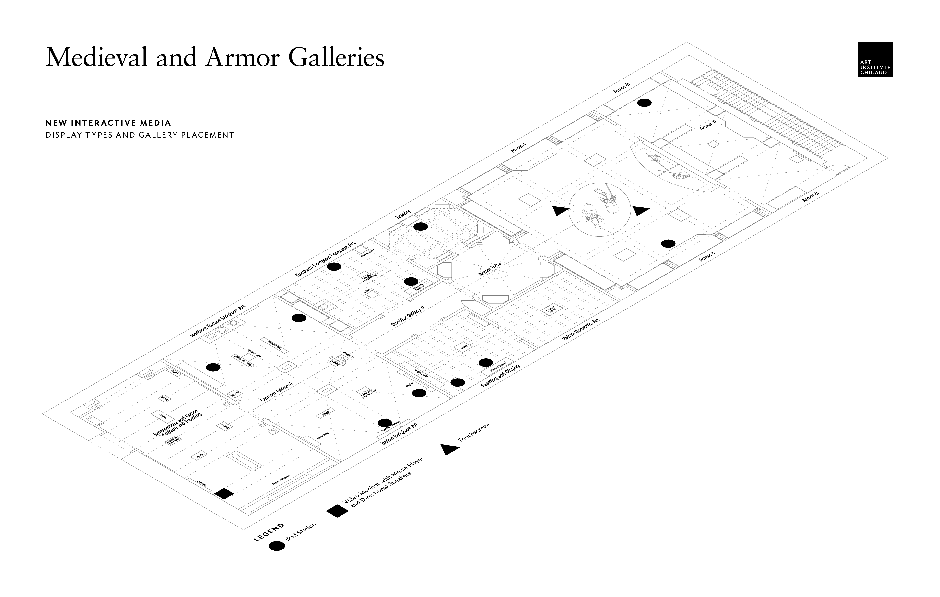
Today, the system we designed is used across more than 50 installations throughout the museum, as well as on its website. The original scope included just 10 interactives—a mix of large-format touchscreens and tablets positioned throughout the gallery, as shown in the plan above.
I drew from an experiential design approach shaped by formative experiences: I interned at Second Story, learning directly from founders Julie Beeler and Brad Johnson, and later studied with Jake Barton, founder of Local Projects, while earning my master’s in Interaction Design. Building on the principles pioneered by these studios—where storytelling, technology, and space come together to shape public experience—we designed a digital layer that didn’t compete with the collection—it deepened it. The goal was to create seamless, story-driven moments of discovery that honored the materiality of the objects while inviting visitors to explore context, meaning, and human connection across time.
These galleries expanded the display of works sixfold, introducing newly conserved pieces and significant acquisitions. But with limited space for physical signage and an increasingly diverse audience with rising expectations for interactive learning, the challenge was clear: how do we deepen engagement and preserve historical nuance without overwhelming the object itself?
Our approach was derived from a simple but powerful belief: interactive content doesn't need to be layered upon a story—it can be deeply integrated and become part of the story. We aimed to infuse motion, narrative, and design into a single immersive flow. The goal wasn’t to build multimedia presentations. It was to build cinematic experiences that invited visitors to look closer, linger longer, and engage more deeply with the past.
A first-hand look at the renovated gallery and new interactives. Produced by the Art Institute.
Observing Visitors to Understand Their Needs
We began by walking the galleries and observing how visitors encountered the art. Digital displays at the time were often encased in bulky anti-theft mounts, tethered to furniture, sending a subtle but unmistakable signal: «we don’t trust you.» Others offered little more than static web pages, navigated by single taps. What was missing was trust, context, and invitation.


We refined our designs based on firsthand observation of museum visitors’ behaviors and needs. The pre-existing gallery space and the legacy interactive setup—loose iPads tethered to benches with steel cables—are pictured above.
To guide our design approach, we partnered closely with curators, technologists, and exhibition designers to align on a simple but powerful interpretive philosophy: digital elements should never overtake, interrupt, or distract from the primary experience of viewing an object. Instead, they should augment it—revealing hidden dimensions and helping visitors connect emotionally, intellectually, and contextually with the work.


We partnered closely with curators, designers, and technologists to align on a simple but powerful interpretive philosophy: digital elements should never overtake, interrupt, or distract from the primary experience of viewing an object.
This thinking mirrored emerging best practices in the curatorial field. We referenced Stuart Frost of the British Museum, who believed the purpose of interpretation is to give audiences insight into a work that they might have missed.
«Museum interpretation isn’t about providing information that visitors passively absorb, but about encouraging them to engage, to look closer at objects, and to reveal something relevant they might otherwise have missed.»
—Stuart Frost, The British Museum
Designing Stories Around the Objects
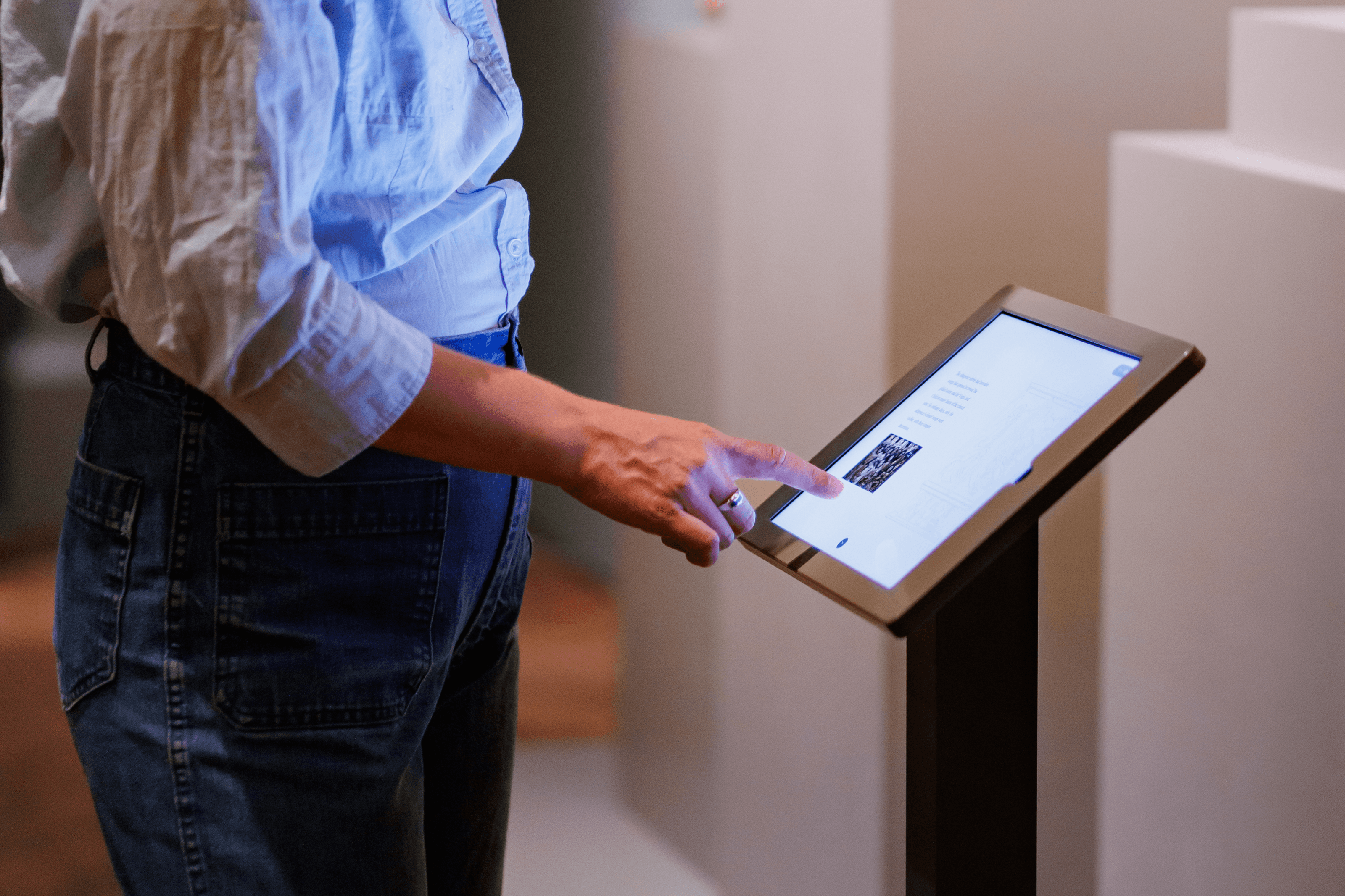
With this in mind, we shaped every interactive as a narrative invitation. Working in tandem with curators, we developed content that reflected key themes—like the blend of fashion and function in 15th-century armor or the geopolitical forces that shaped the art of Northern Europe. Where static labels could only hint at a story, our touchscreens provided motion, gesture, and multimedia to show and tell.
We designed experiences that seamlessly integrated multimedia that unfolded as visitors—moved through them. Each interactive used tools tailored to its content: animated infographics, geographic timelines, embedded 3D models, and annotated close-ups. These weren’t «extras»—they were essential interpretive strategies. One interactive allowed visitors to rotate and explore the articulation of a sabaton boot, revealing how it was engineered not just for battle, but also as a statement of status. Another used layered maps to trace the flow of materials and ideas between Renaissance workshops and distant empires.


We designed experiences that seamlessly integrated multimedia, attracting, engaging, and unfolding naturally as visitors moved through the space—enhancing the act of looking rather than distracting from it. This approach was grounded in the belief that encountering an object should provoke awe, curiosity, and emotional connection.
Building for Longevity and Flexibility
Our systems had to be as durable as the stories they told. We built for longevity on three levels: physical (choosing casework that could be updated or repaired), visual (using a timeless, brand-aligned design language), and technical (building a CMS that allowed museum staff to manage content with ease). By integrating directly with CITI, the museum’s internal collections database, we created a seamless pipeline that ensured accuracy and reduced duplication across platforms.
Because the collection is a permanent exhibit, we needed to design for the long term. This meant the physical casework, hardware, software, and experiences needed to be able to adapt and endure over time without substantial investment. We selected casework designed for easy replacement. The touchscreens themselves are iPads.
This design strategy addressed a key institutional need: while custom media treatments might be feasible for special exhibitions, the museum required systems that could scale sustainably across permanent installations. By creating a modular, flexible framework, we gave the museum a template for future interactives—something that could be applied not only to the Deering Galleries, but to other departments and even the website.


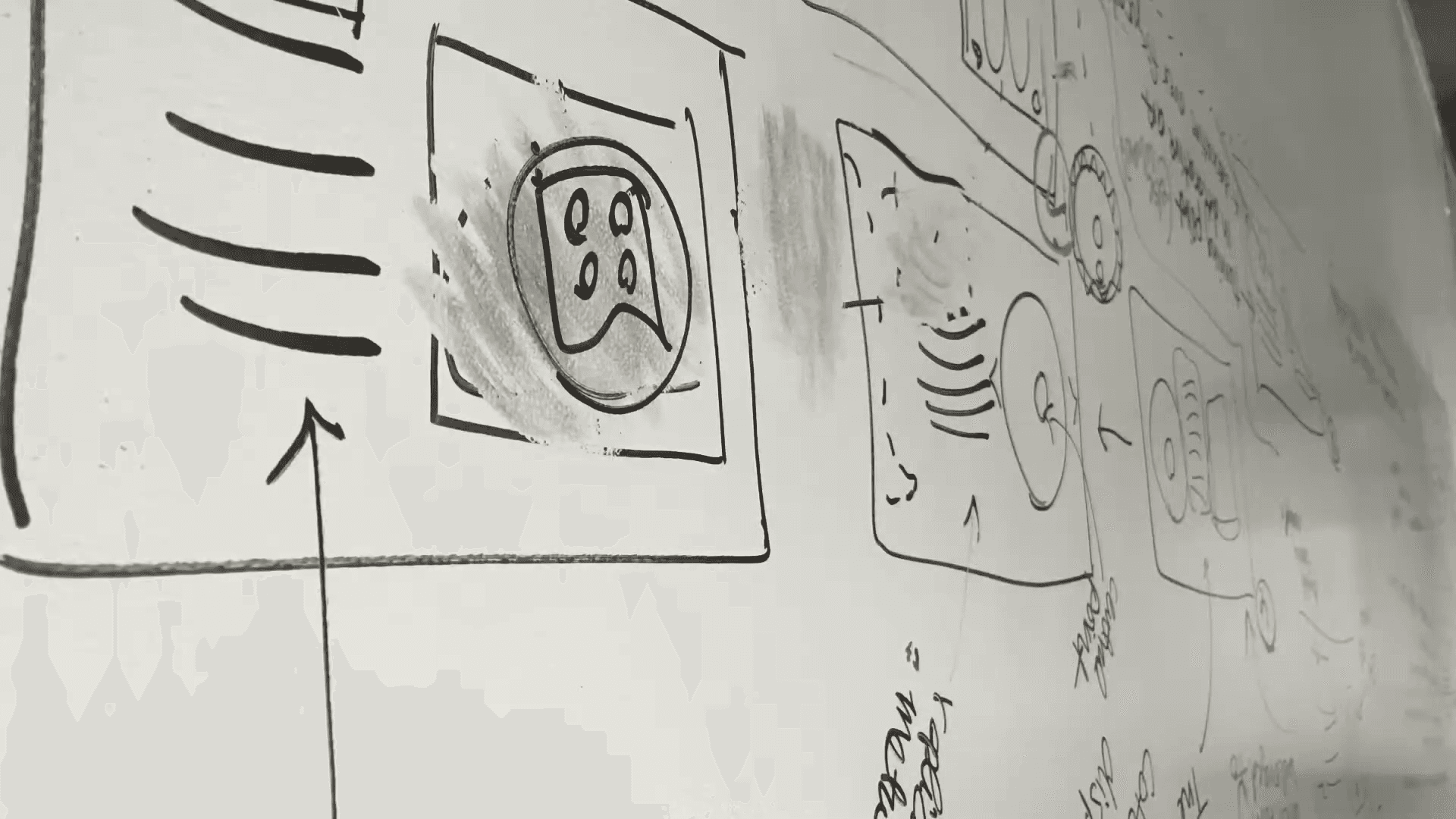
We proposed interaction models using low-fidelity prototypes to demonstrate how simple gestures—like press-and-drag—could let users rotate objects in three dimensions directly on screen or dynamically interact with data. Above: Hybrid prototypes that blend the visual sequencing of a cinematographer’s storyboard with the structural clarity of a user flow—used to convey both gesture logic and screen transitions.
Through a rigorous prototyping process—moving from wireframes to gallery-tested simulations—we refined every gesture and narrative thread. We tailored interactions to how visitors naturally engage in shared public space: swipe to explore, tap to reveal, rotate to discover. Our design offered just enough guidance to encourage exploration, but left room for individual interpretation.
Low-fidelity prototypes helped evaluate each interactive’s effectiveness, technical feasibility, and long-term viability. Above: A prototype simulating scroll-triggered screen changes. The interaction mimics cinematic pans—drawing inspiration from documentaries and film techniques like the Ken Burns effect, which animates still images through slow, deliberate zooms and horizontal movement to create a sense of narrative momentum. A second prototype created with Framer to describe how secondary content might be displayed with tap interactions.
Delivering Lasting Impact
Today, the interactives we designed are used in over 50 locations throughout the museum—and as the physical footprint has expanded, the Art Institute has also made these experiences available online. People around the world can now explore the same interpretive features on the museum’s website, where the interactives draw an average of 1,300 unique visitors each month, with nearly 3 minutes of engagement per session.
The web experiences include stories from the Deering collection and they’ve also been extended to feature contemporary works from across the museum’s holdings, Salvador Dalí’s surrealist sculpture, Venus de Milo with Drawers, depicted above.
«The museum’s most innovative use of technology and interactive experiences to date.»
—Michael Neault, Associate Vice President, Art Institute of Chicago
In the digital landscape, where average time-on-page typically hovers under a minute, this level of sustained engagement is remarkable. It suggests that visitors aren’t just skimming—they’re exploring with curiosity and care. The design and content are doing their job: welcoming visitors into the story of each object and rewarding their attention with clarity, depth, and delight.
While the web experiences include stories from the Deering collection, they’ve also been extended to feature contemporary works from across the museum’s holdings, including Amy Sherald’s iconic portrait of then First Lady Michelle Obama and Salvador Dalí’s surrealist sculpture, Venus de Milo with Drawers. Visitors continue to spend an average of 4:46 minutes at each in-gallery kiosk—nearly double the typical museum benchmark. Most digital installations are retired after three years. Ours have lasted more than six.
Between 2017 and 2019, the museum saw a steady increase in admissions, culminating in $292.45 million in revenue and over 6% growth in ticket sales. More importantly, the interactives helped reinforce the Art Institute’s mission as an institution of learning, connection, and public service.
This project affirmed our belief that digital interpretation isn’t just a layer of content—it’s a philosophy of care. When thoughtfully applied, digital tools don’t distract from art; they draw us into it. They invite curiosity, surface hidden histories, and make centuries-old objects feel newly alive.
❦