Etsy
Optimizing Etsy’s Checkout
Optimizing Etsy’s checkout to reduce friction, lift conversion rates, and drive marketplace-wide improvements—one experiment at a time.
Tags
Experimentation
Design Lead Role
Product Discovery
Provocations
Service Blueprinting
Role
Design Lead, Payments Organization
$6M
Incremental Gross Merchandise Sales (GMS)
0.07%
Conversion Rate Growth
0.18%
Average Converting Browser Value (ACBV) Growth
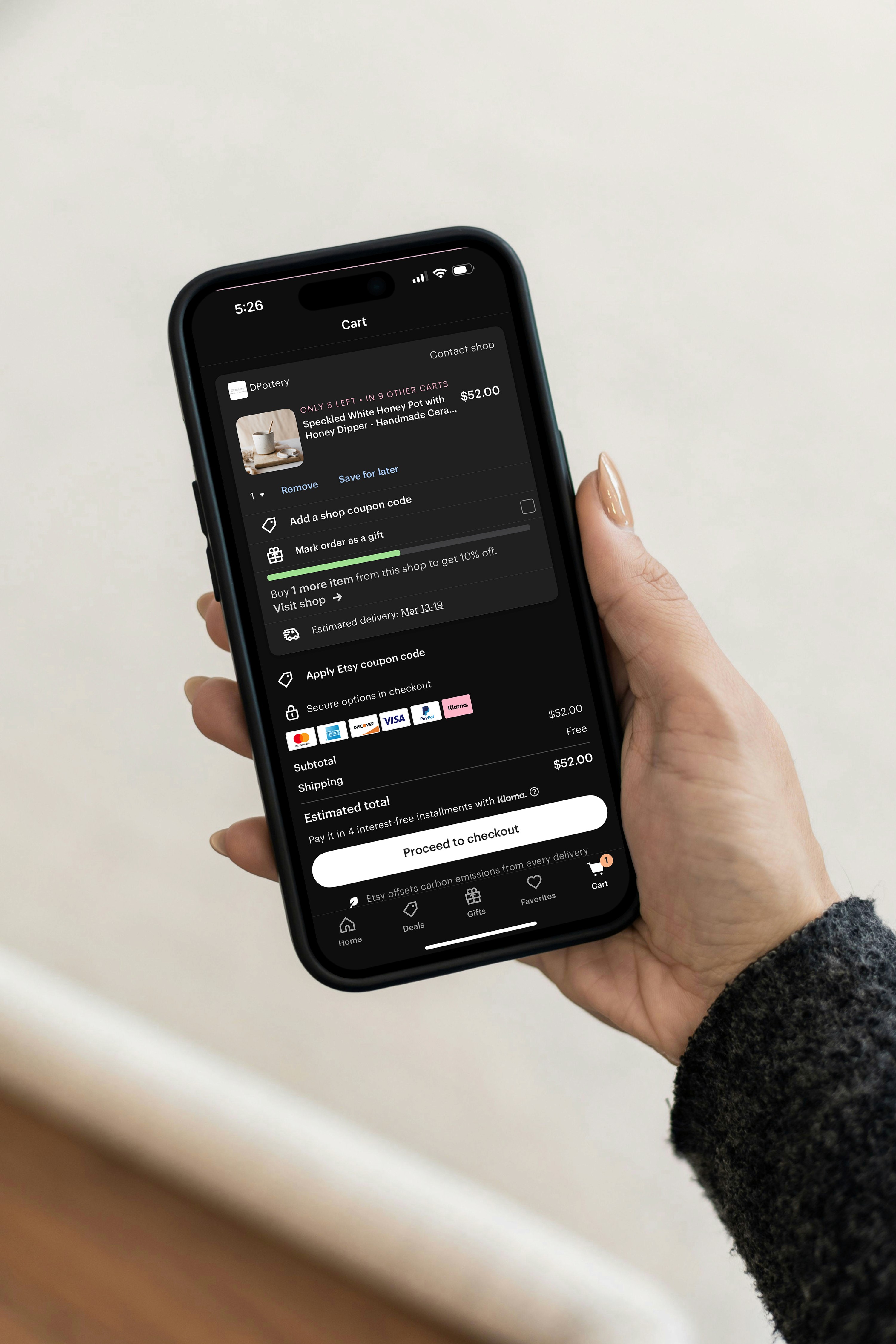
Etsy’s Checkout Experience plays a critical role in a commerce ecosystem that powers 93% of the company’s GMS. While the broader platform evolved, checkout remained largely unchanged—revealing structural weaknesses as mobile adoption grew and Buyer expectations shifted.
Etsy Payments and the Checkout Experience
Etsy is a two-sided marketplace connecting 91 million Buyers with 6.4 million Sellers worldwide. Etsy Payments facilitates 93% of the company’s Gross Merchandise Sales (GMS)—a key metric that measures the total volume of goods sold on the platform—and contributes 27% of its total revenue, making it the backbone of Etsy’s commerce ecosystem.
Over the years, Etsy’s platform evolved to meet the growing needs of Buyers and Sellers, but the checkout experience remained largely unchanged. While teams focused heavily on improving browsing and discovery, the final—and most critical—step in the Buyer journey had seen relatively little innovation. As mobile adoption surged and Buyer expectations shifted, underlying weaknesses in the checkout experience became increasingly visible, signaling the need for systemic change.
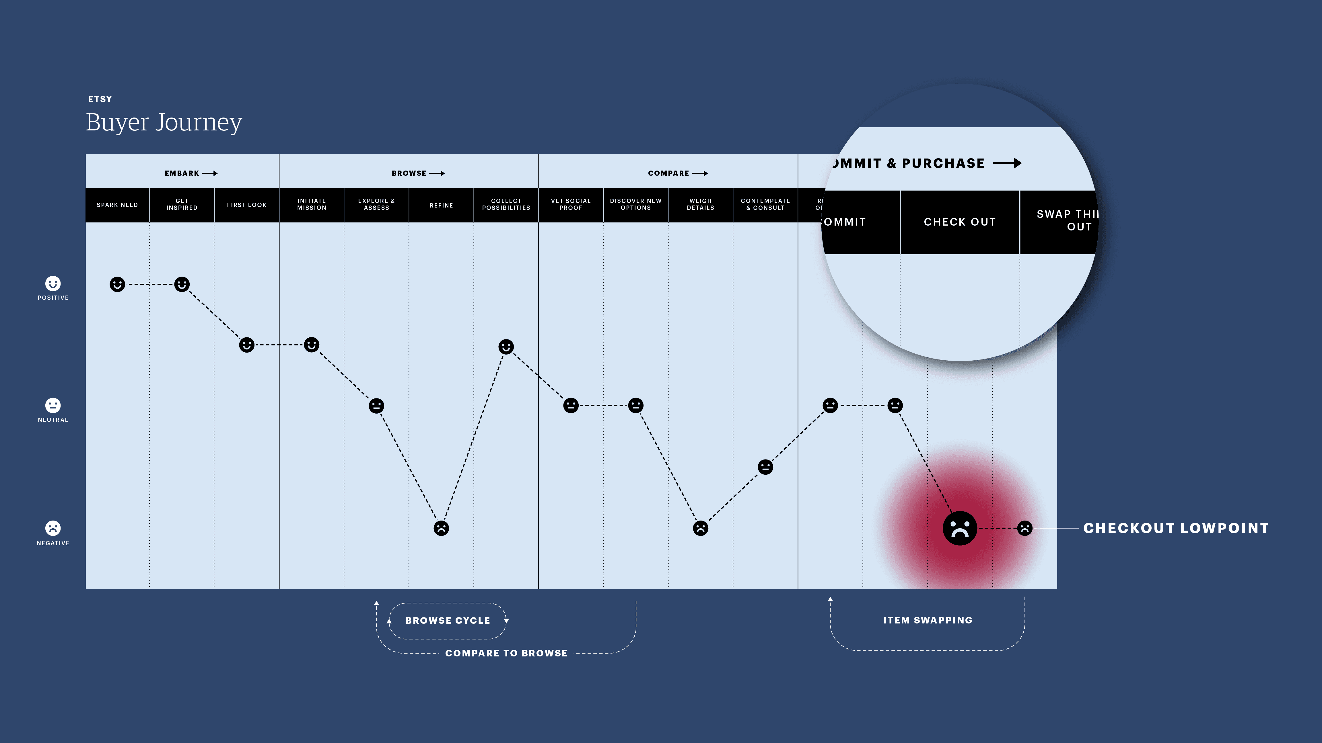
Etsy’s checkout funnel regulates the flow of Gross Merchandise Sales (GMS), animating the marketplace and reinforcing its network effects. However, despite its critical role, the checkout experience had not kept pace with shifting Buyer behavior. In the two years leading up to this work, conversion rates fell 7%, signaling growing Buyer frustration.
Role & Responsibilities
Recognizing the strategic importance of Payments and its untapped potential, I advocated for a transition from design management to an individual contributor role to lead the redesign of Etsy’s checkout experience. This shift allowed me to deeply engage in design strategy, product discovery, and service blueprinting while ensuring my work aligned with Etsy’s broader business objectives.
I oversaw five product designers, each embedded in a cross-functional squad focused on different areas of the Payments experience:
Two squads focused on Buyer initiatives
Another pair on Seller experiences
One on international payments
In addition to leading design efforts across these squads, I collaborated with Payments leadership to shape organization-level strategy, ensuring design played a central role in Etsy’s long-term vision for Payments. I also worked closely with Etsy’s policy and operations teams, advocating for Buyer-friendly changes that would have lasting marketplace-wide impact.
How Sticker Shock and Information Overload Decreased Conversion
Etsy’s checkout funnel regulates the flow of Gross Merchandise Sales (GMS), animating the marketplace and reinforcing its network effects. However, despite its critical role, the checkout experience had not kept pace with shifting Buyer behavior. As mobile adoption increased, the Buy on Etsy (BOE) app became the dominant platform for purchases, yet in the two years leading up to this work, checkout conversion rates fell 7%, signaling growing Buyer frustration.
Conversion rate is a key focus for Payments squads because it directly impacts Etsy’s topline metric, GMS: GMS = Visits × Conversion Rate × Average Converting Browser Value.
As Design Lead, I helped bridge the gap between design and business strategy by ensuring our decisions aligned with Etsy’s top-level metric: Gross Merchandise Sales (GMS). But for some designers, GMS felt abstract. To make it more tangible, I broke the equation down into its components—Visits, Conversion Rate, and Average Converting Visit Value—and reframed each one as a «How Might We» question. This allowed squads to align around actionable design challenges. For example, instead of setting a vague goal to «boost conversion,» I asked, «How might we make it easier for returning buyers to complete a purchase?»
In our efforts to reduce friction in checkout, we discovered two key barriers to conversion: sticker shock and cognitive overload.
A recurring theme in Buyer research, sticker shock stemmed from Etsy’s marketplace model, where Buyers frequently faced multiple shipping fees from different Sellers. This led to unexpectedly high total costs at checkout, disrupting purchase intent and driving abandonment.
Pricing transparency wasn’t the only issue—the way price information was structured compounded the problem. Buyers struggled with cognitive overload, where dense, fragmented information made it difficult to process key details efficiently. Research showed that when information is harder to digest, Buyers subconsciously associate it with higher costs, reinforcing the perception that they were spending more than they actually were.
By addressing both sticker shock and cognitive overload, we saw an opportunity to increase pricing clarity, reduce hesitation, and improve conversion rates—not just by changing what Buyers saw, but by redesigning how they experienced price information.
Service Blueprinting to Prioritize Checkout as the Highest-Impact Opportunity
To visualize where and how Buyers encountered pain points during checkout, I developed a service blueprint mapping the entire Payments journey. Given Etsy’s two-sided marketplace model, where Payments powers both the Buyer and Seller experience, it was essential to map both sides because much of the content and pricing Buyers see at checkout is directly influenced by decisions and inputs from Sellers. Understanding this relationship helped us identify where misalignment or friction in Seller-supplied content—such as pricing structures, shipping fees, or policies—impacted the Buyer experience.
This blueprint provided a holistic view, revealing not only Buyer and Seller interactions but also the technical and operational processes shaping the checkout flow. Creating this blueprint helped the team:
Identify gaps in Buyer and Seller interactions that contributed to friction.
Establish a shared understanding across product, design, engineering, and operations.
Prioritize modernizing checkout as the highest-impact opportunity to improve conversion.
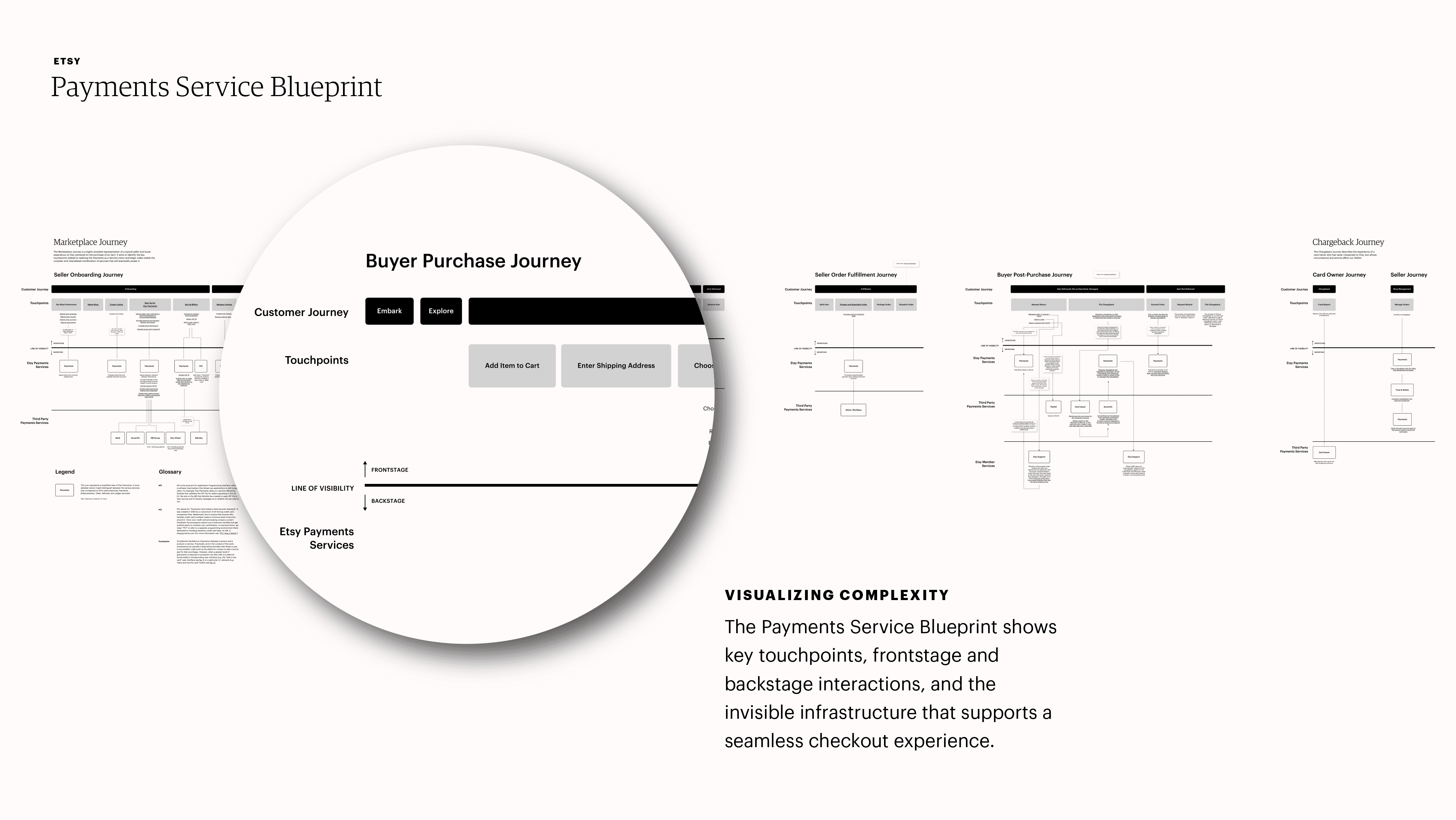
This service blueprint visualizes the complexity of Etsy’s Payments system, revealing both what’s visible to users and what happens behind the scenes. Zooming in on the swimlane labels, you can see core blueprint elements: customer-facing touchpoints, the line of visibility that separates frontstage from backstage activity, and key technical layers that power transactions. This artifact supports cross-functional alignment by clarifying the relationships between people, systems, and processes. Most importantly, it led us to prioritize modernizing checkout as the highest-impact opportunity for Payments squads supporting the Buyer–Seller experience across more than 40 countries.
Discovery & Experimentation: Tackling Sticker Shock
With a clear focus on revamping checkout to increase conversion, we began with product discovery—a structured process for identifying customer problems worth solving, developing lightweight solutions, and validating them through experimentation. Discovery is one of three core activities in Etsy’s unified product development approach:
Product Strategy: Determining which problems to solve
Product Discovery: Identifying solutions
Product Delivery: Building, testing, and deploying those solutions
Etsy’s approach to discovery drew from Lean, Agile, and Design Thinking, allowing teams to tailor their process to specific challenges. Regardless of the specific methodology, every discovery process began with collaboration between designers and researchers, ensuring solutions were grounded in qualitative and quantitative insights.
Product Discovery is a collaborative process—but not in the shallow sense. True breakthroughs happen when designers, product managers, and engineers come together to exchange ideas, challenge assumptions, and spark creative collisions. As much as executives, marketers, or designers might believe they’re the source of the best ideas, Marty Cagan reminds us: «Some of the best product ideas come from the engineers.» D.I.W.O. (Do It With Others) is a mindset I’ve practiced throughout my career—from co-designing with engineers to facilitating workshops with executives. When we create space for creative collisions, we unlock solutions no one could reach alone.
Identifying Sticker Shock as a Key Friction Point
Existing research identified sticker shock as a major yet under-addressed pain point. This issue appeared across multiple studies and was first captured in Etsy’s internal Voice of the Customer program:
«Buyers find it hard to understand the total cost of an item when browsing and get ‹turned off› when a higher cost is shown later in the journey.»
Research insight from Etsy's Voice of the Customer program
Sticker shock occurs when Buyers experience surprise, disbelief, or frustration upon encountering a total order price significantly higher than expected. This most commonly happens at the Review step of checkout, where Buyers see the final price—including shipping costs—for the first time.
On mobile, the Review step stacked four vertically arranged modules: shipping details, payment method, order details, and the final order summary. Since the total price appeared at the bottom, Buyers only saw their full cost after progressing through the entire checkout journey. We hypothesized that when this final price was unexpectedly high, Buyers abandoned their purchase—not just due to cost, but because of the frustration of wasted effort.
This issue was even more pronounced when Buyers purchased from multiple Sellers. Unlike Amazon, which centralizes fulfillment and charges a single shipping fee, Etsy operates as a marketplace of independent Sellers, each shipping from different locations. As a result, Buyers placing multi-shop orders often encountered multiple shipping charges, further amplifying sticker shock and increasing checkout abandonment.
Existing research identified sticker shock as a major yet under-addressed pain point, occurring when buyers experience surprise, disbelief, or frustration upon encountering an order's total price for the first time. Buyers placing multi-shop orders often encountered multiple shipping charges, further amplifying sticker shock and increasing checkout abandonment.
A Risk-Based Approach to Experimentation
With a clear understanding of the problem, I collaborated with the Checkout squad’s product designer to explore solutions using the diverge-converge framework, first developed by U.C. Berkeley systems designer Béla H. Bánáthy and later popularized by consultancies like IDEO. To encourage divergent thinking, we conducted a half-day workshop, rapidly generating and synthesizing ideas into a dozen design provocations—a research method I introduced to Etsy’s product design team.
However, engineering bandwidth was limited, requiring us to prioritize rigorously. Rather than evaluating ideas based on intuition, we applied a risk-based prioritization framework to assess each provocation against four key risks inherent to product delivery:
Value Risk: Will customers want this?
Usability Risk: Is it accessible and easy to use?
Feasibility Risk: Can we build it with available resources?
Viability Risk: Does this align with Etsy’s business objectives?
To structure decision-making, the Product Manager, Product Designer, and I met to discuss each provocation, then used dot voting, an Agile technique popularized by Google’s Design Sprint, to determine which ideas to test first. Participants explained their rationale aloud, externalizing their thinking to ensure alignment. Recognizing that the PM was ultimately accountable to leadership, I worked with the Product Designer to give the PM additional votes, ensuring that prioritization reflected both business goals and design insights.
This structured approach allowed us to focus engineering resources on the most promising solutions while maintaining cross-functional alignment on what mattered most.
Leading Contenders for Experimentation
The dot voting exercise produced two leading contenders:
Sticky Order Summary: Introducing total costs earlier in checkout
Order Summary Up Top: Restructuring content hierarchy in the Review step
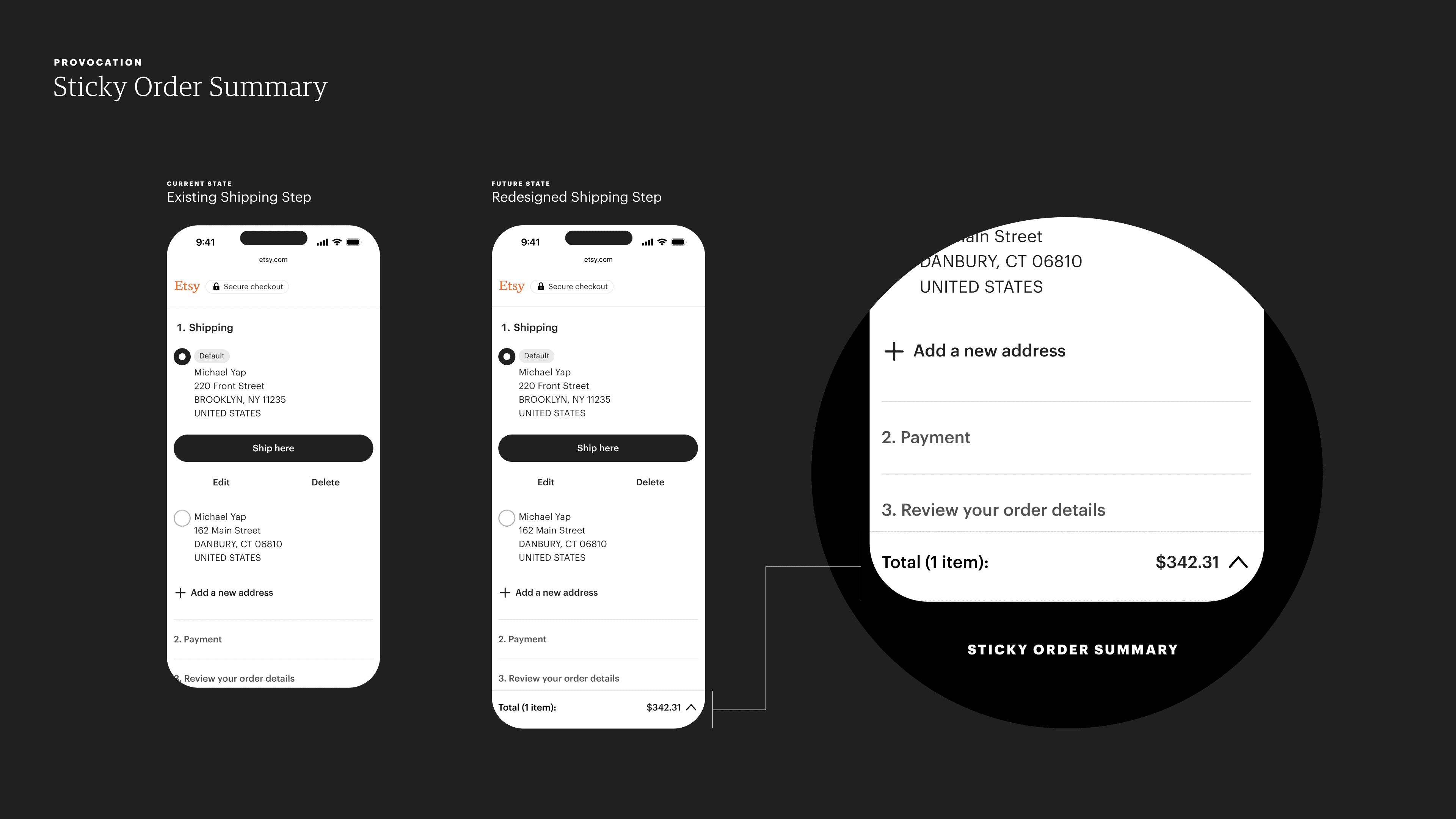
Sticky Order Summary is an unobtrusive UI element that appears at the bottom of the first step—Shipping—dynamically displaying the total order cost upfront, rather than surprising buyers with it at the end of the checkout experience.
Sticky Order Summary
This solution aimed to reduce sticker shock by introducing total costs earlier in the checkout flow, rather than surprising Buyers at the final step.
We applied progressive disclosure to balance transparency with simplicity—providing cost visibility without overwhelming Buyers. This unobtrusive UI element appears at the bottom of the Shipping step and remains visible through the Review step.
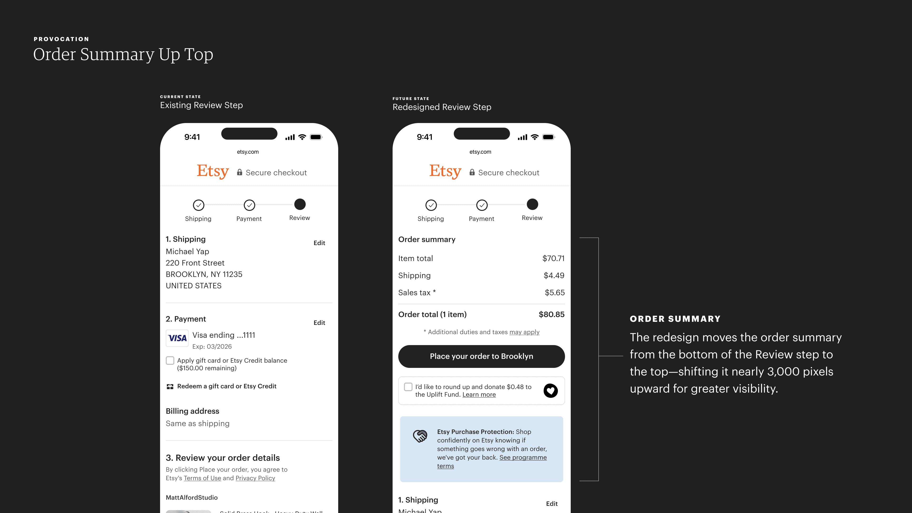
In the original experience, the Order Summary appeared at the bottom of the Review step. We hypothesized that moving it to the top—making price visibility more immediate rather than an unwelcome reveal—would reduce Sticker Shock as a barrier to conversion.
Order Summary Up Top
The second contender took a content-first approach by restructuring the Review step’s information hierarchy.
In the existing flow, the total order price was displayed at the bottom of the Review step—meaning Buyers only saw it after completing every prior checkout step.
We hypothesized that surfacing the total cost earlier would reduce frustration and create a more transparent experience, improving clarity and reducing last-minute hesitation.
Once we aligned on prioritization, the product designer refined the provocation for experimentation, ensuring alignment with Etsy’s design system and creating necessary exception states.
During this phase, we also presented the work in weekly Payments design critiques, which I co-led with my peer product design manager. These sessions allowed us to share progress with other Payments designers, gather feedback to identify potential gaps, and surface insights—such as first-hand experience or relevant research we hadn’t considered—that could shape our direction.
With finalized designs in hand, the product designer partnered with engineers to implement and deploy the experiment at scale.
Impact of Tackling Sticker Shock
Once deployed, our experiments yielded unexpected results. The Sticky Order experiment trended neutral, while Order Summary Up Top harmed conversion rates, with a greater drop on desktop than mobile. While these outcomes suggested that restructuring information alone wasn’t enough to reduce sticker shock, they led to a critical insight:
Sticker shock wasn’t just a UX problem—it was a company-wide policy issue.
The real driver of checkout friction wasn’t necessarily when prices were displayed—it was the underlying cost structures themselves. Etsy’s marketplace model meant Buyers often encountered multiple shipping charges, Seller-imposed handling and packing fees, and other cost inflations that increased total order prices unpredictably.
Armed with this insight, I worked with the Product Manager and design leadership to escalate our findings beyond checkout design. As a result, Etsy implemented company-wide policy changes, including removing Seller-imposed handling and packing fees, which had been artificially inflating total costs.
This work demonstrated that small, incremental experiments can have outsized influence, not just in optimizing UX but in driving systemic change across an organization. It reinforced my approach to tackling complex challenges—by methodically testing, analyzing, and expanding our scope, we not only improved conversion rates but also shaped Etsy’s marketplace policies for long-term success.
Addressing Cognitive Overload in Checkout
Sticker shock wasn’t the only checkout pain point our research uncovered. Prior studies on multi-shop purchases revealed that Buyers often felt overwhelmed by dense information in the Review step, subconsciously associating it with higher costs. As one participant put it:
«I looked at the screen like, oh my gosh, I just racked up hundreds of dollars […] then looked down and saw only $30. When there are too many numbers, I assume I’m spending more money.»
Research insight from Etsy's Voice of the Customer program
This insight pointed to two key issues:
Cognitive Overload: When excessive information overwhelms Buyers, making decisions harder and increasing checkout abandonment.
Cognitive Fluency and Perceived Cost: When fragmented or cluttered pricing details make costs seem higher than they actually are.
I first encountered these concepts in graduate school while studying Interaction Design. In a data visualization course with Nicholas Felton, I learned how presentation shapes perception, comprehension, and decision-making. Later, in a typography and communication course, guest speaker Nick Bilton (The New York Times) framed this as one of digital design’s biggest challenges: reducing cognitive load to help people process information efficiently. Since reading isn’t an innate human ability, poorly structured content only increases cognitive strain.
Years later, these insights proved invaluable in tackling cognitive overload in Etsy’s checkout experience.
The Challenge of Simplifying the Review Step
During a workshop with our squad, we explored ways to reduce information density in the Review step. We started with an information architecture technique—creating a content inventory to separate content from its visual layout, helping us assess its purpose and relevance in isolation.
This analysis revealed that every piece of text had been added with intent, introduced by different squads or teams to solve specific business or customer needs. Over time, content accumulated, increasing both complexity and surface area.
For example, a seemingly minor line—Ships from the United States—might have appeared redundant, but it resulted from a past experiment aimed at reducing Buyer hesitation around international shipping. Data showed it reassured Buyers and increased conversion. Removing it would erase a validated win, highlighting why simplification required more than just cutting content.
Since reaching out to multiple teams to remove content would take days, if not weeks, we pursued a different approach: grouping information to improve scanability and reduce cognitive load.
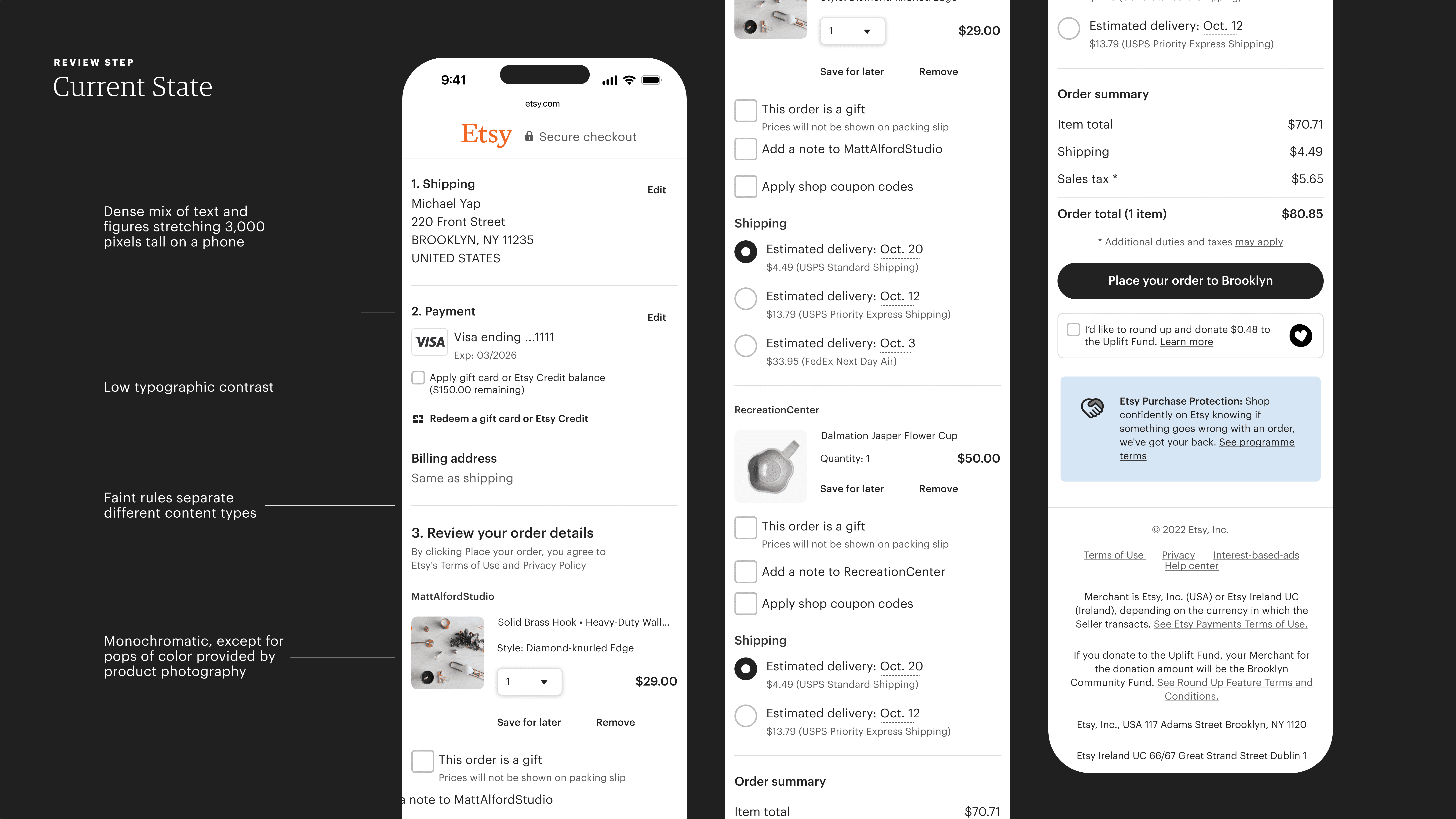
On mobile, the Review Page stretched nearly 3,000 pixels tall—about as long as a New York Times article labeled a «3-minute read»—filled with a dense mix of text and numerical figures.
The existing Review page felt like a wall of text. On mobile, it stretched nearly 3,000 pixels tall—about as long as a New York Times article labeled a «3-minute read.» Weak typographic contrast in size, font, and weight resulted in a flat gray tone, with only a faint 1-pixel light gray rule separating sections. The only meaningful color contrast came from item thumbnails, with credit card logos (30 pixels high) as the only other visual break.
Applying Gestalt and Bauhaus Principles
To simplify the page, we grouped related information. Instead of separating shipping and payment details, we combined them under a single heading—«Shipping and Payments»—reducing complexity and saving space. This consolidation also shortened the page’s height.
To improve visual separation, we enclosed each group within a bounding box with an outline and drop shadow, creating the illusion of depth. Additionally, we set the page background to gray, increasing contrast and making the grouped content stand out.
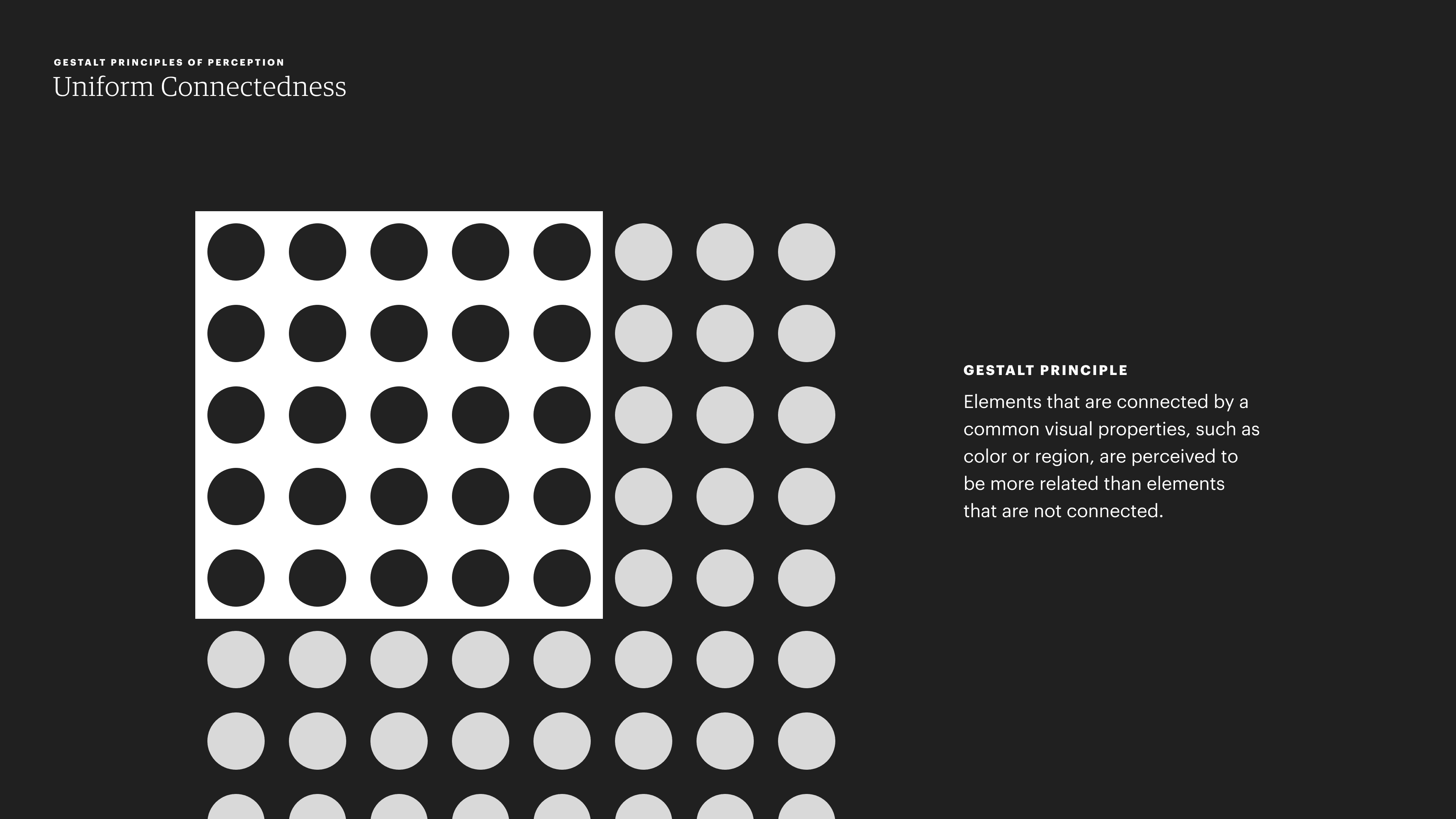
The principle of uniform connectedness is the most recent addition to the principles referred to as Gestalt Principles of Perception. The work was conducted by Stephen Palmer and Irvin Rock and introduced in their whitepaper: «Rethinking Perceptual Organization: The Role of Uniform Connectedness». Psychonomic Bulletin & Review, Vol. 1, 1994.
The Design Thinking Behind Our Approach
Visually grouping similar elements reduces complexity—a principle I internalized through Gestalt theory and its Bauhaus design applications. Gestalt psychology teaches that humans instinctively organize information into wholes rather than fragmented parts, making structured groupings essential for clarity. On the Review page, grouping related content satisfied this cognitive need, improving scanability and comprehension.
At the same time, visual separation prevented the page from feeling like a monolithic block of text. Instead of an undifferentiated mass, content was structured into distinct yet connected sections, helping Buyers see both the parts and the whole. This balance—seeing the trees without losing sight of the forest—enhanced usability and readability.
Bauhaus designers emphasized functional minimalism, where form follows function. They used grid systems, asymmetry, and typographic contrast to structure content clearly, guiding the eye naturally across a composition. Inspired by this, we reinforced hierarchy through grouping, spacing, and contrast, ensuring that key information stood out while maintaining an intuitive, structured layout.

Gestalt psychology teaches that people naturally organize information into coherent wholes, not isolated fragments—making structured groupings essential for clarity. On the Review page, grouping related content met this cognitive need, and when paired with increased typographic contrast, it improved scanability and comprehension.
Impact of Reducing Cognitive Load
Unlike previous experiments aimed at mitigating sticker shock, this redesign delivered the impact we sought. We saw a 0.07% lift in conversion rate (CR) and a 0.18% increase in average converting browser visit (ACBV)—translating to a $6M GMS win.
Incremental gains like these are critical for hitting annual targets. Our squad’s goal was $90M in annualized incremental GMS—a daunting figure at first glance. But this win alone accounted for 6.56% of that target and 26.22% of our $22.5M quarterly goal, proving that meaningful progress comes from steady, continuous improvements.
It’s a testament to how we tackle ambitious goals: one experiment win at a time.
Learnings
Eat Elephants One Bite at a Time
This project exemplifies how I lead teams to tackle ambitious goals: one experiment at a time. As the saying goes, How do you eat an elephant? One bite at a time. Instead of chasing a single breakthrough, we tested small, incremental hypotheses, each generating wins that, in aggregate, moved us closer to our goal.
This approach is rooted in two concepts central to my design philosophy:
Continuous Deployment
Leadership as De-Risking Failure
Before becoming CEO, Chad Dickerson served as Etsy’s CTO, where he instilled an engineering ethos of continuous deployment—the practice of making small, frequent changes to production instead of waiting for a single «killer» feature. Inspired by lean manufacturing, this approach minimizes risk and ensures steady progress, preventing bottlenecks and large-scale failures.
Design thrives on learning from mistakes—whether a small UI inconsistency or a platform-level disruption. Mistakes are opportunities for discovery, revealing unexpected problems that drive creativity.
As a design leader, I focus on making mistakes low-risk and reversible, enabling teams to experiment without fear of failure. Methods like A/B testing in production, combined with the ability to roll back failed experiments, allow teams to validate hypotheses in real time—without jeopardizing business metrics or the user experience.
By lowering the cost of failure, we empower squads to experiment more freely, accelerating both learning and innovation.
Share Losses as Widely as Wins
Experiment failures are just as valuable as wins—but only if we share them. Had we not openly discussed our failed sticker shock experiments with other squads and leadership, Etsy might not have implemented policy changes at a company level.
By treating losses as learning opportunities rather than setbacks, we ensured that experimentation didn’t just drive short-term UX improvements—it also led to long-term systemic change that reshaped marketplace policies.
Teach Teams How to Recover from Failure
Losing an experiment—especially one you believed in—can be demoralizing. But in a culture of continuous improvement, learning how to recover is just as critical as learning how to succeed. Some of the best lessons on resilience don’t come from product development—they come from sports psychology.
Studies on athlete recovery reveal three key psychological traits that help teams bounce back from setbacks:
Growth Mindset: Viewing failure as an opportunity to learn, not a permanent setback.
Goal Setting & Adaptability: Breaking big objectives into smaller, achievable milestones keeps teams motivated.
Self-Compassion: Being patient through failures fosters long-term creativity and problem-solving skills.
As a leader, I apply these principles by coaching teams through failure with empathy, ensuring that setbacks become springboards for future success.
Final Thoughts
This work underscored a critical insight: not all checkout friction can be solved with UX alone. While experiments in information hierarchy and pricing transparency helped improve clarity, the true driver of sticker shock was structural—a direct result of marketplace policies that shaped how Buyers experienced costs.
By methodically testing, analyzing, and escalating our findings, we transformed a UX challenge into an opportunity for marketplace-wide change. Etsy’s removal of Seller-imposed handling fees wasn’t just a design fix—it was a policy shift that fundamentally improved pricing transparency across the platform.
More broadly, this project reinforced my belief that complex, high-impact problems aren’t solved in a single leap—they require continuous experimentation, cross-functional collaboration, and a commitment to learning from failure.
At Etsy, I’ve applied this mindset to challenges at every scale, from iterating on micro-interactions to influencing systemic business decisions. In the end, our job as designers isn’t just to make interfaces clearer—it’s to help shape the conditions that make better experiences possible.
❦


